BRAND IDENTITY | WEBSITE DESIGN
BRE is a 100 year old, world-leading building science centre. It's mission is to improve building and infrastructure through research and knowledge generation. The aim was to bring the brand into the digital era, by streamlining and modernising the existing identity, without removing the visual equity that has been built throughout the years.
Strategy: And Then Associates
Site build: twotenstudio
Animations: Dexter George
— Brand Identity | Website Design
— Strategy: And Then Associates
— Site build: twotenstudio
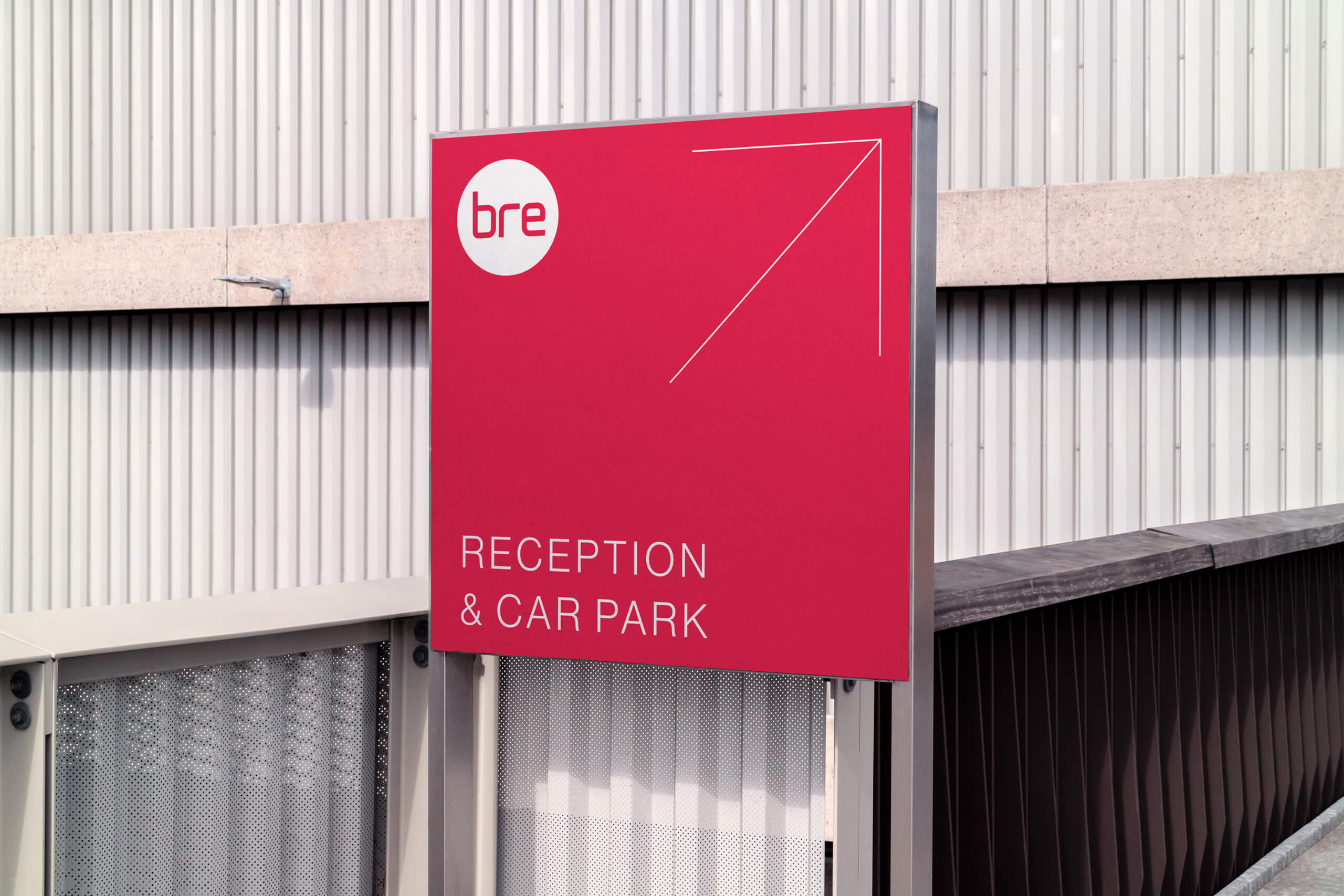
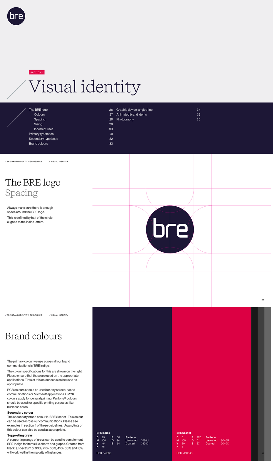
The BRE logo was redrawn with visual clarity in mind. The letters were re-spaced with greater geometric contrast for legibility at different scales.
The circle encases the lettering, creating a simpler icon for internal teams to place onto communications without legibility issues.
BRE has 4 business pillars; Knowledge, Innovation, Research and Assurance. These presented an opportunity to create a series of animations for the brand. The goal was to increase the visual quality beyond printed items and into the digital landscape.
Looking to the future; the animations can update and adapt as the company moves forward, while maintaining the core brand.
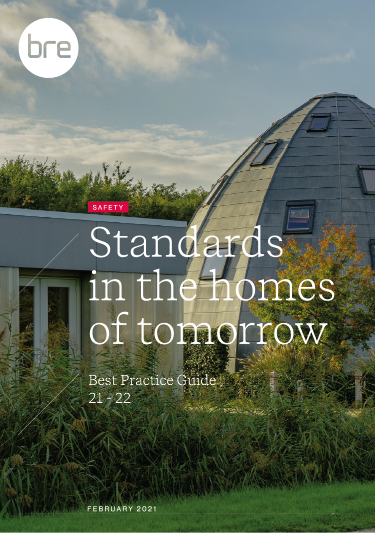
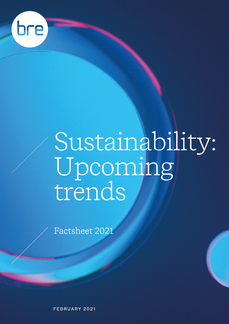
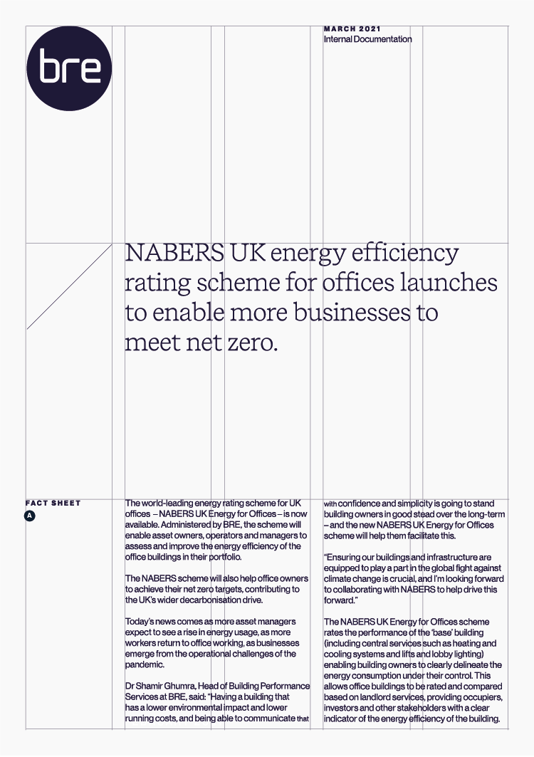
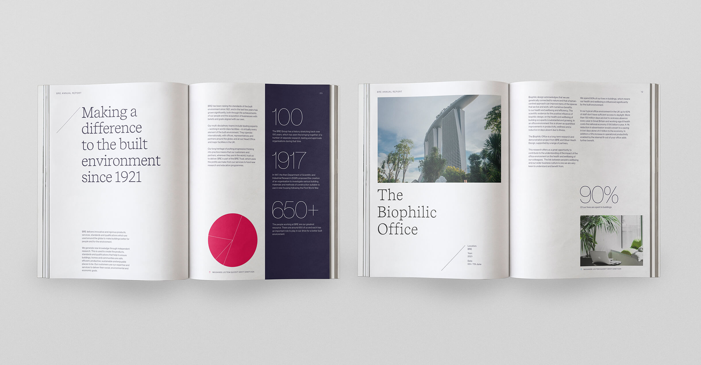
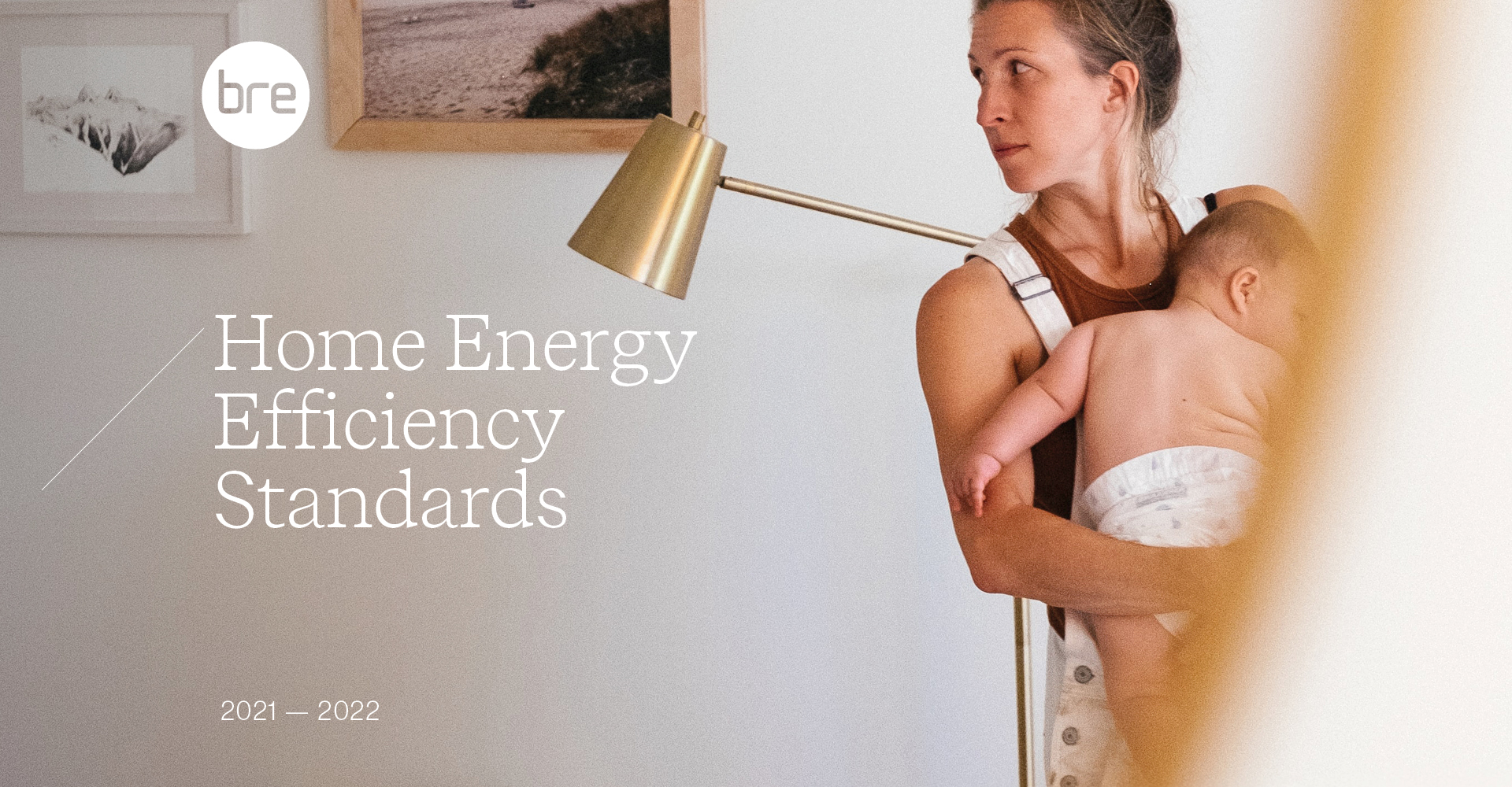
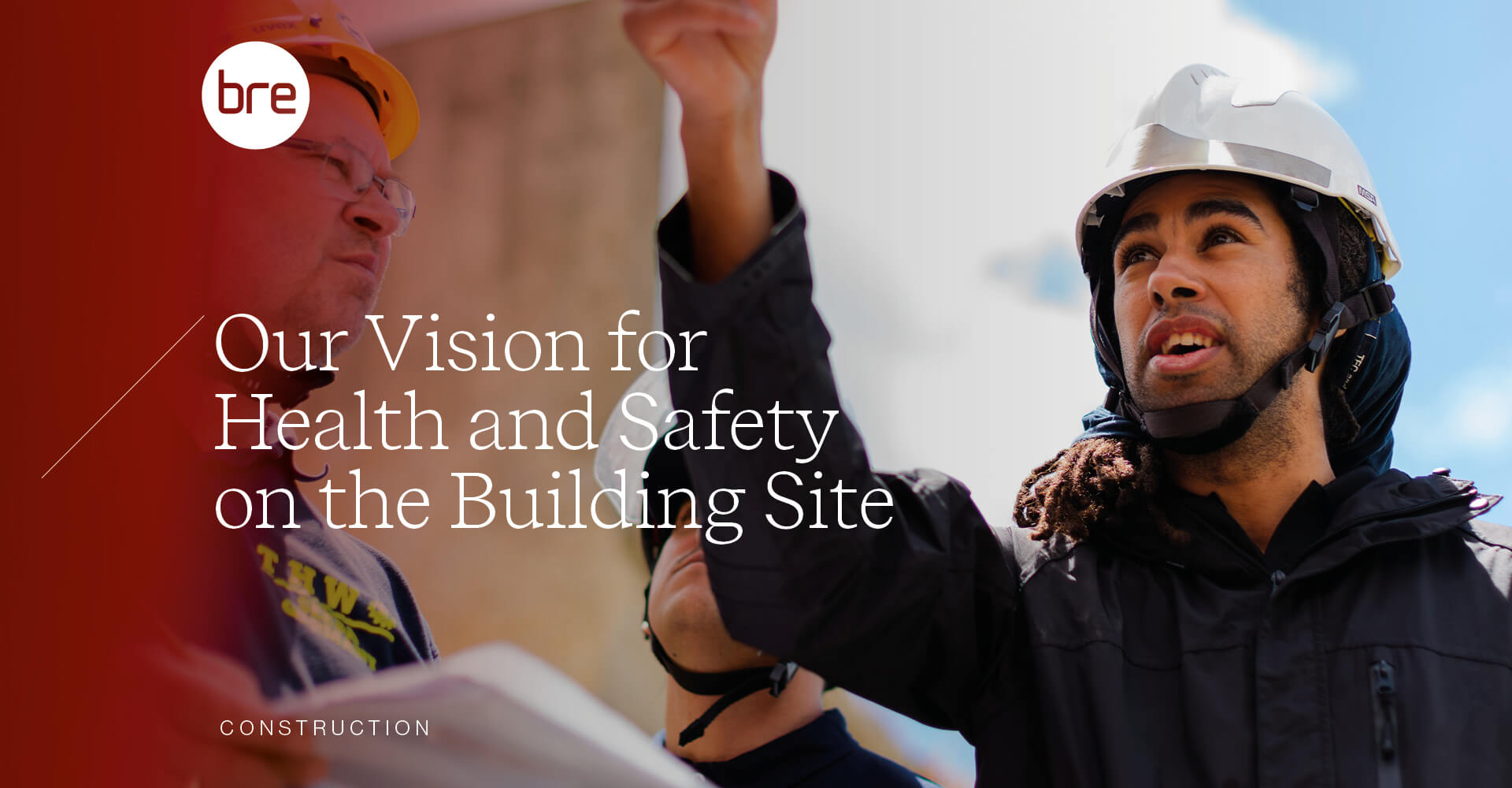
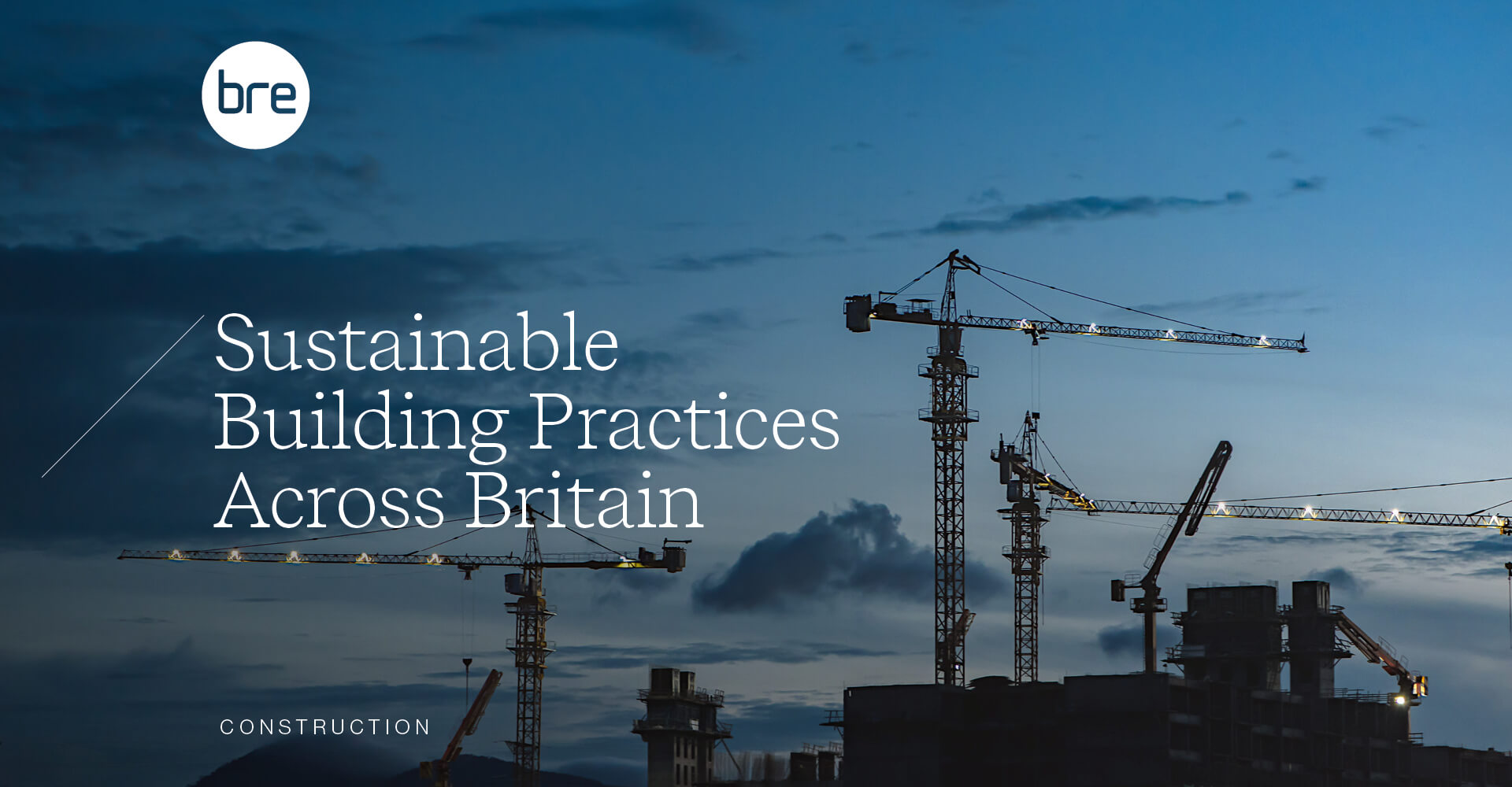
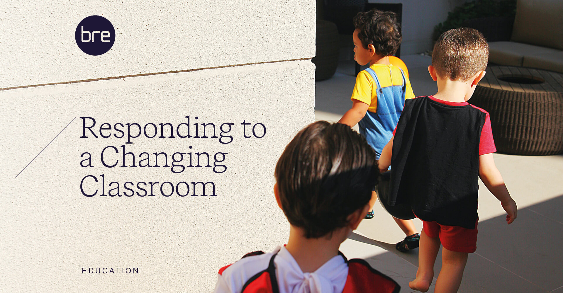
To create a sense of unity, a disciplined typography system is in place throughout the collateral. To cater for such a wide range of communications from internal documents, annual reports, guides and downloadable resources, the design system now enables the BRE team to speak with the same voice across all touchpoints.
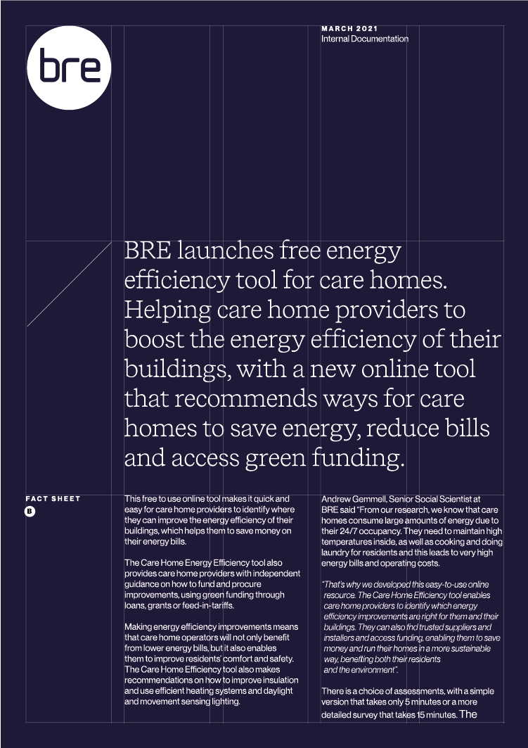
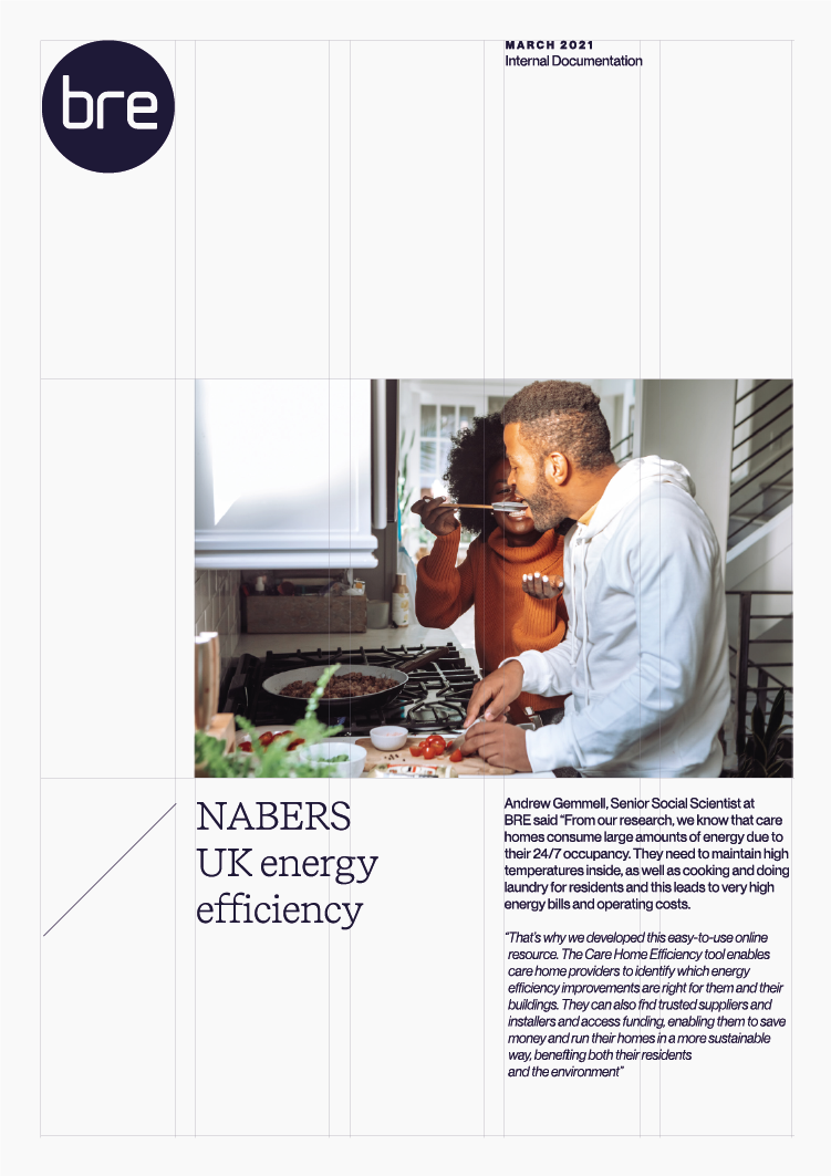
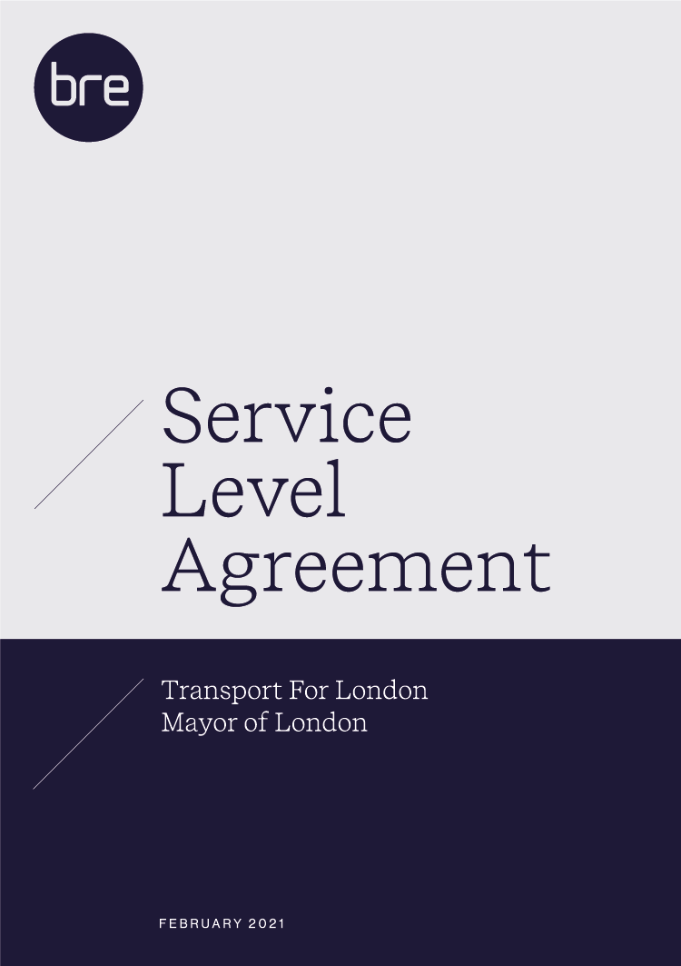
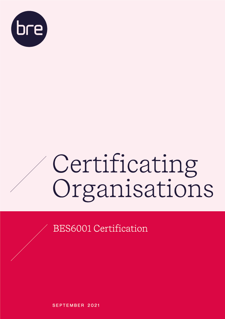
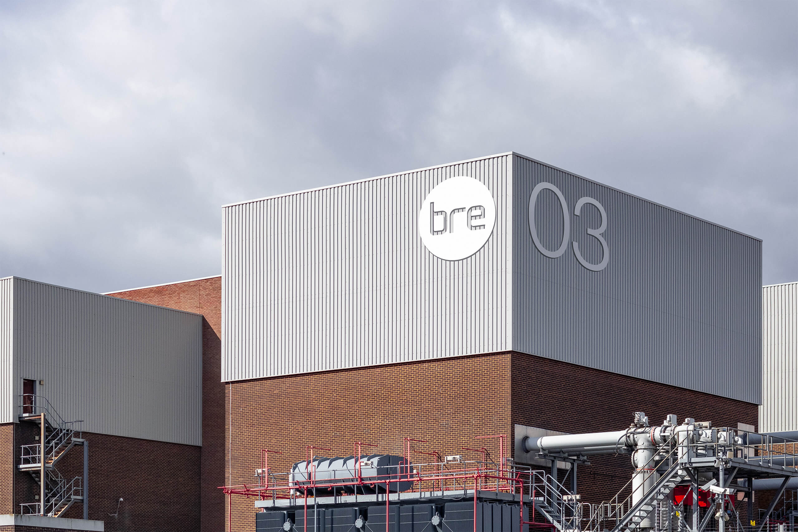
The BRE campus is an integral part of the organisation. As well as a functioning building test site for fire, auditory and structural experiments, it is also home to the 300+ staff head-office.
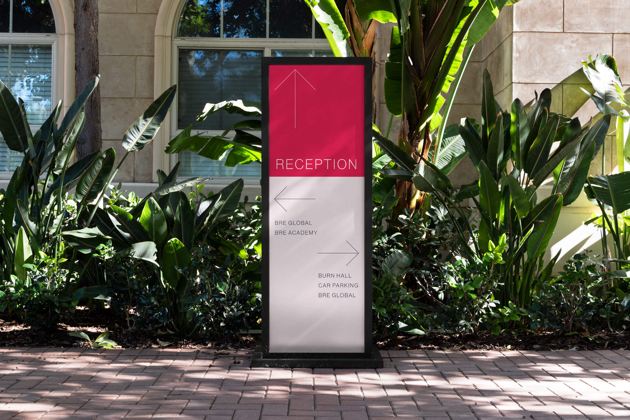
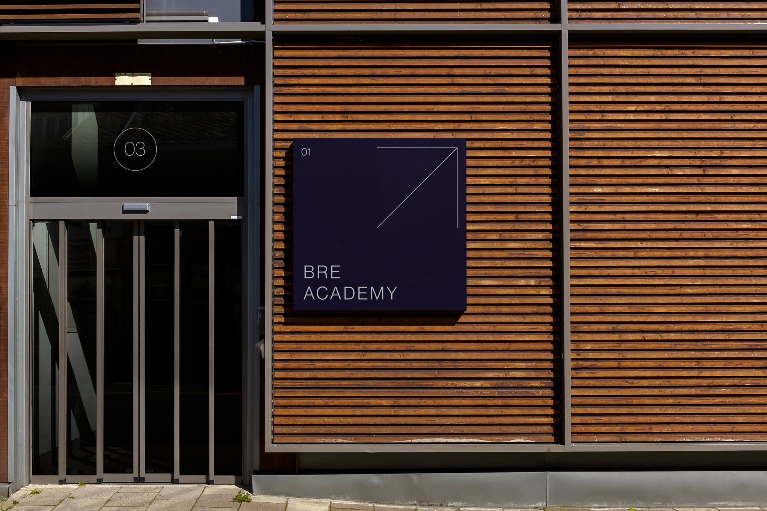
An elegant and clean icon suite supports a wide range of messaging.
The style is purposefully built to make it less labour intensive for the suite to grow.
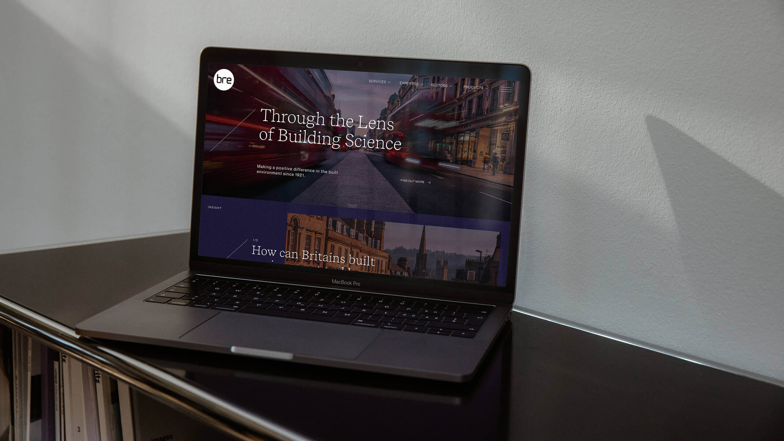
A full website redesign wasn’t required to launch the new brand. The solution was to create a new homepage that incorporates the new brand and updating the style-sheets of the existing pages with the new colour palette and typefaces.
Our team worked alongside BRE’s digital team to adjust the architecture, built on a Wordpress back-end.
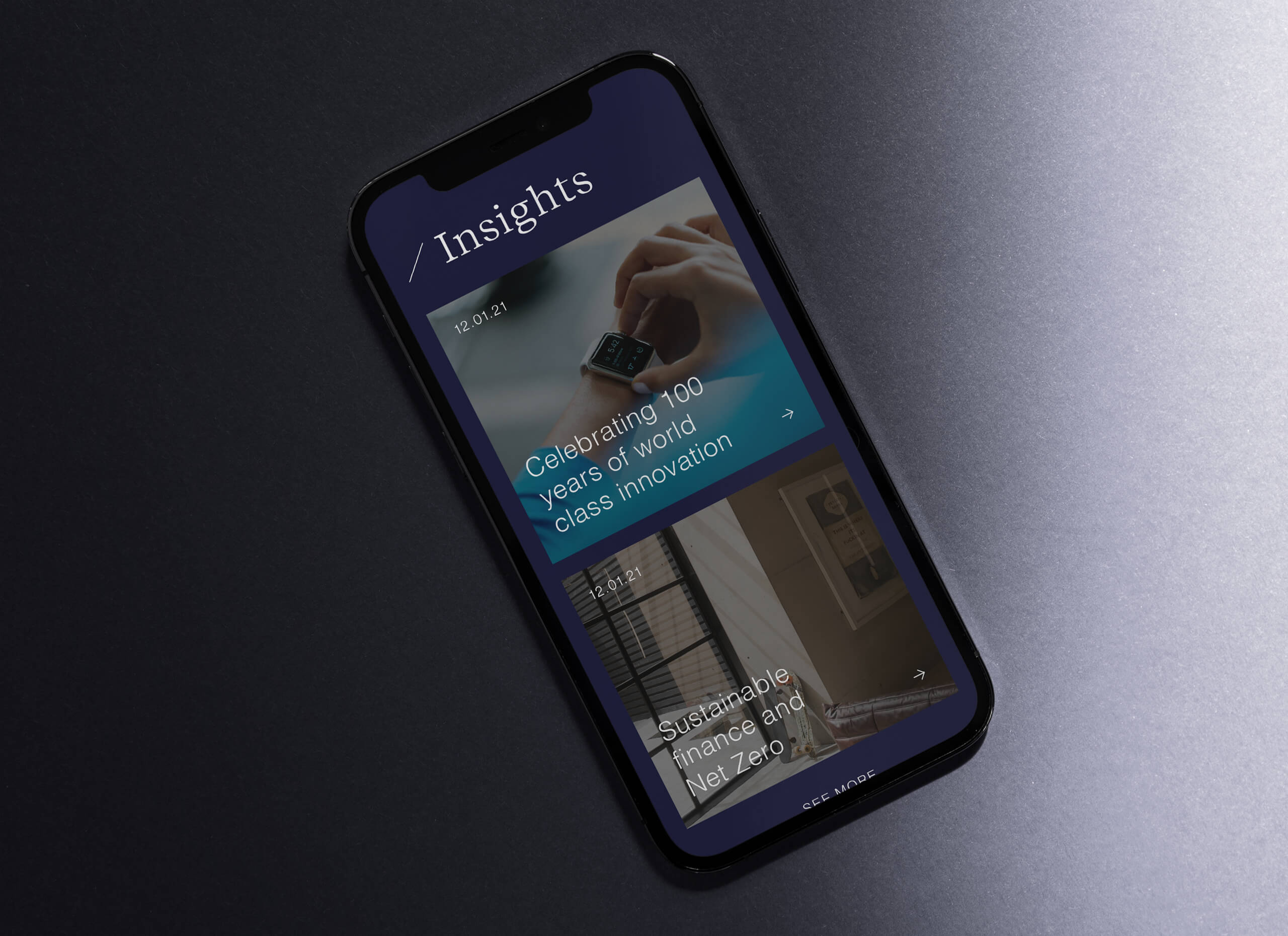
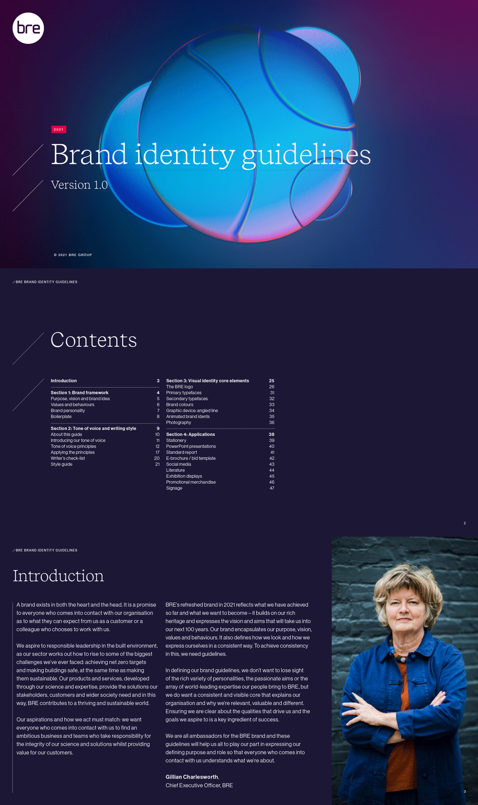
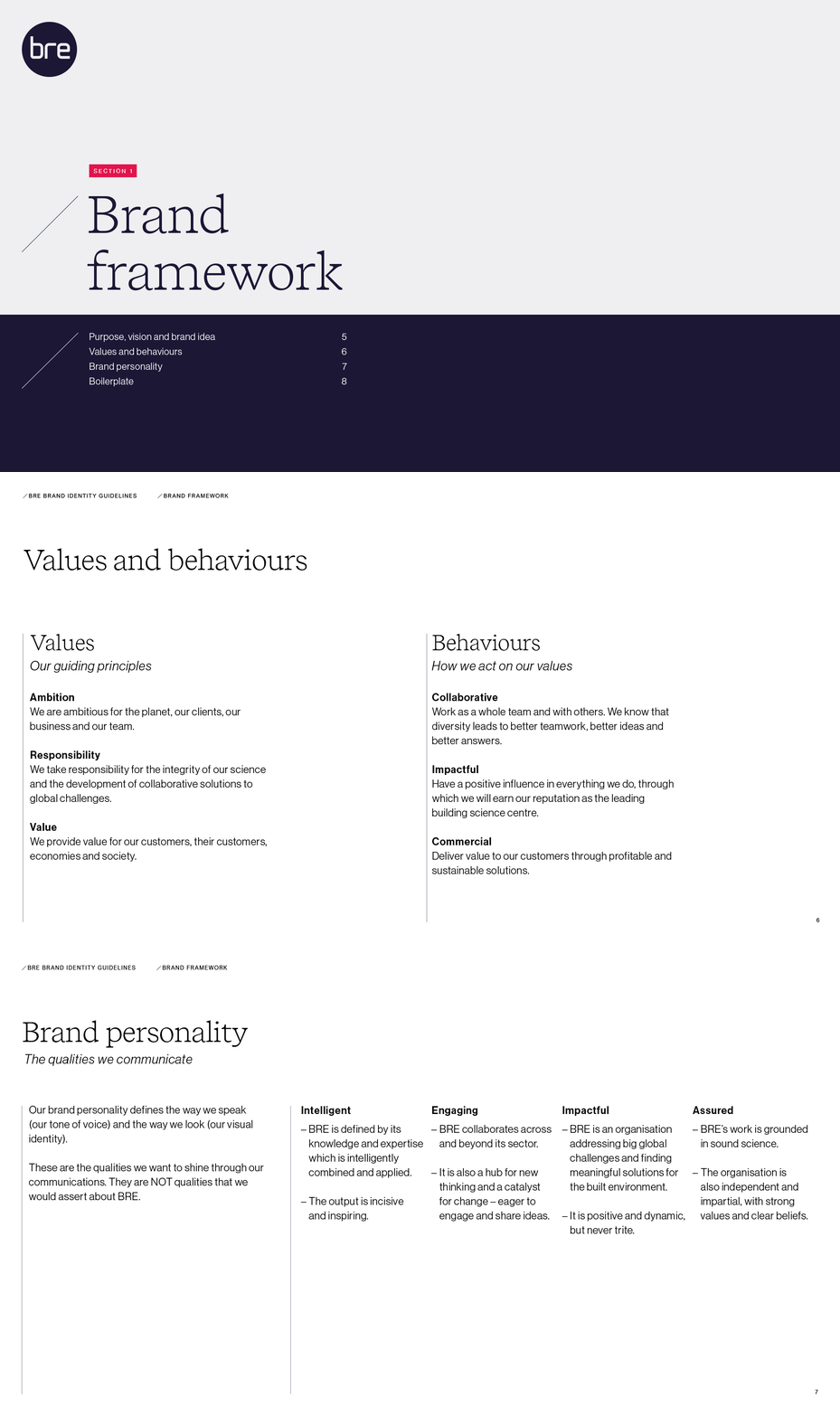
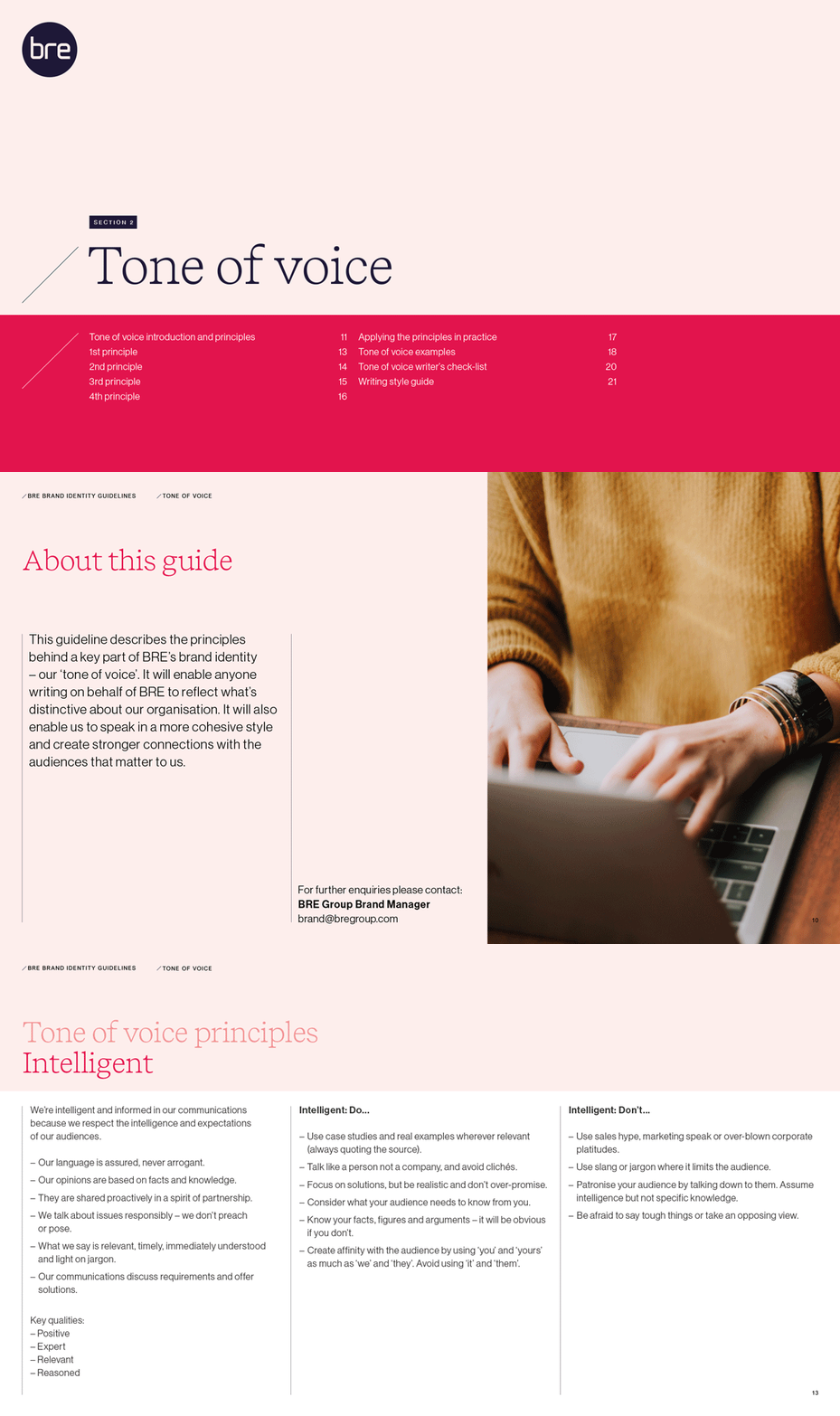
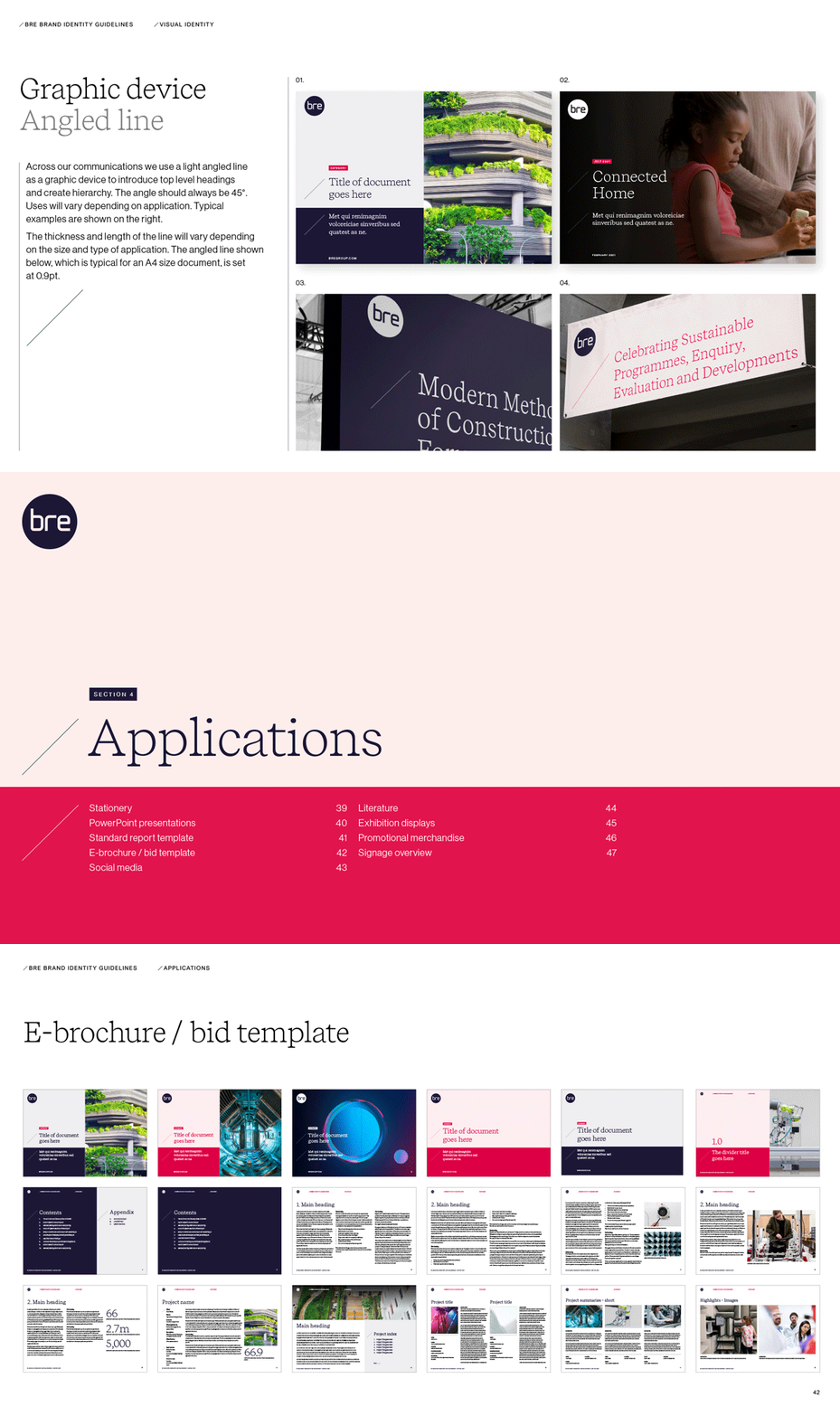
A comprehensive set of guidelines was created to consolidate the vast world of BRE. From typography, colour palette, lock-up’s and imagery do’s and don’ts, the guideline allows their team or other third-party agencies to follow in the footsteps of the new brand.
NUEKER ©2024
ADDRESS
UNIT 6
MALTINGS PLACE
169 TOWER BRIDGE
LONDON
SE1 3JB
CONTACT
020 806 364 48
info@nueker.co.uk